
Optimising Product
Optimising Product
Discovery on Mobile
Discovery on Mobile
In a fast-paced e-commerce environment, every interaction matters… especially when it comes to adding products. User behaviour revealed that many struggled with this key action. This case study shows how we improved CTA visibility and affordance to streamline the experience and boost conversions.
In a fast-paced e-commerce environment, every interaction matters… especially when it comes to adding products. User behaviour revealed that many struggled with this key action. This case study shows how we improved CTA visibility and affordance to streamline the experience and boost conversions.
Company: HUEL
Company: HUEL
Role: UX Resercher & Designer
Role: UX Resercher & Designer
Date: September 2022
Date: September 2022
The Starting Point…
The Starting Point…
A Misleading Call to Action
A Misleading Call to Action
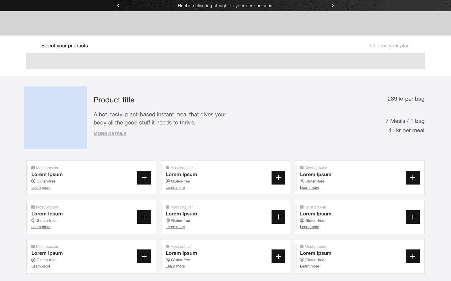
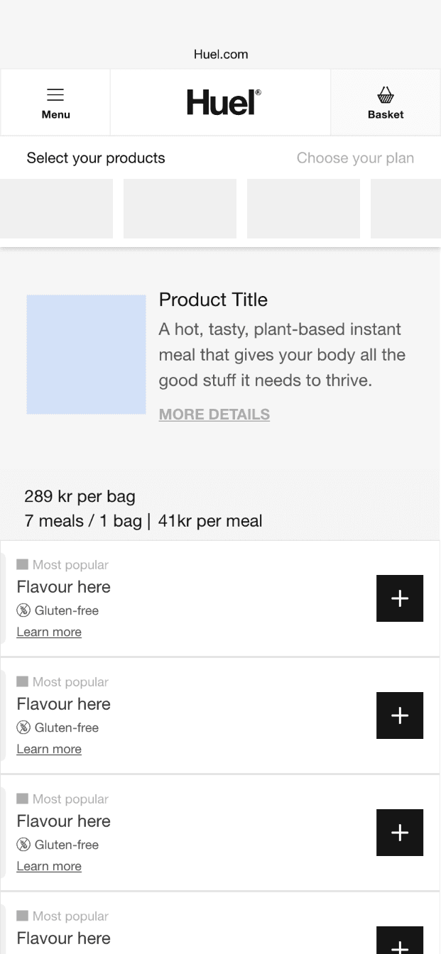
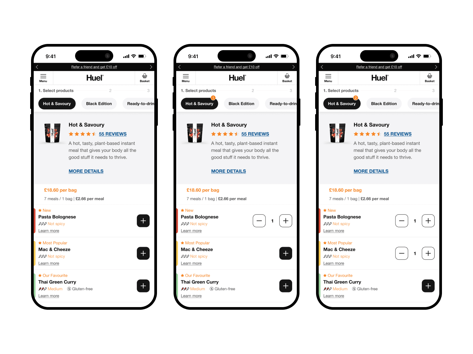
During a routine analysis of our platform's session recordings, we noticed something peculiar, frustrated users repeatedly tapping on our product flavour cards with no result. Our analytics told an alarming story, despite healthy traffic to our product pages, cart additions remained low.
During a routine analysis of our platform's session recordings, we noticed something peculiar, frustrated users repeatedly tapping on our product flavour cards with no result. Our analytics told an alarming story, despite healthy traffic to our product pages, cart additions remained low.
The culprit?
The culprit?
The culprit?
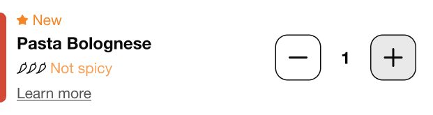
A deceptively minimalist “+” button that blended into the background, leaving users unaware of its functionality.
A deceptively minimalist “+” button that blended into the background, leaving users unaware of its functionality.
Why Users Were Struggling?
Why Users Were Struggling?
Why Users Were Struggling?
Our minimalist design, while visually clean, created unintended friction for users.
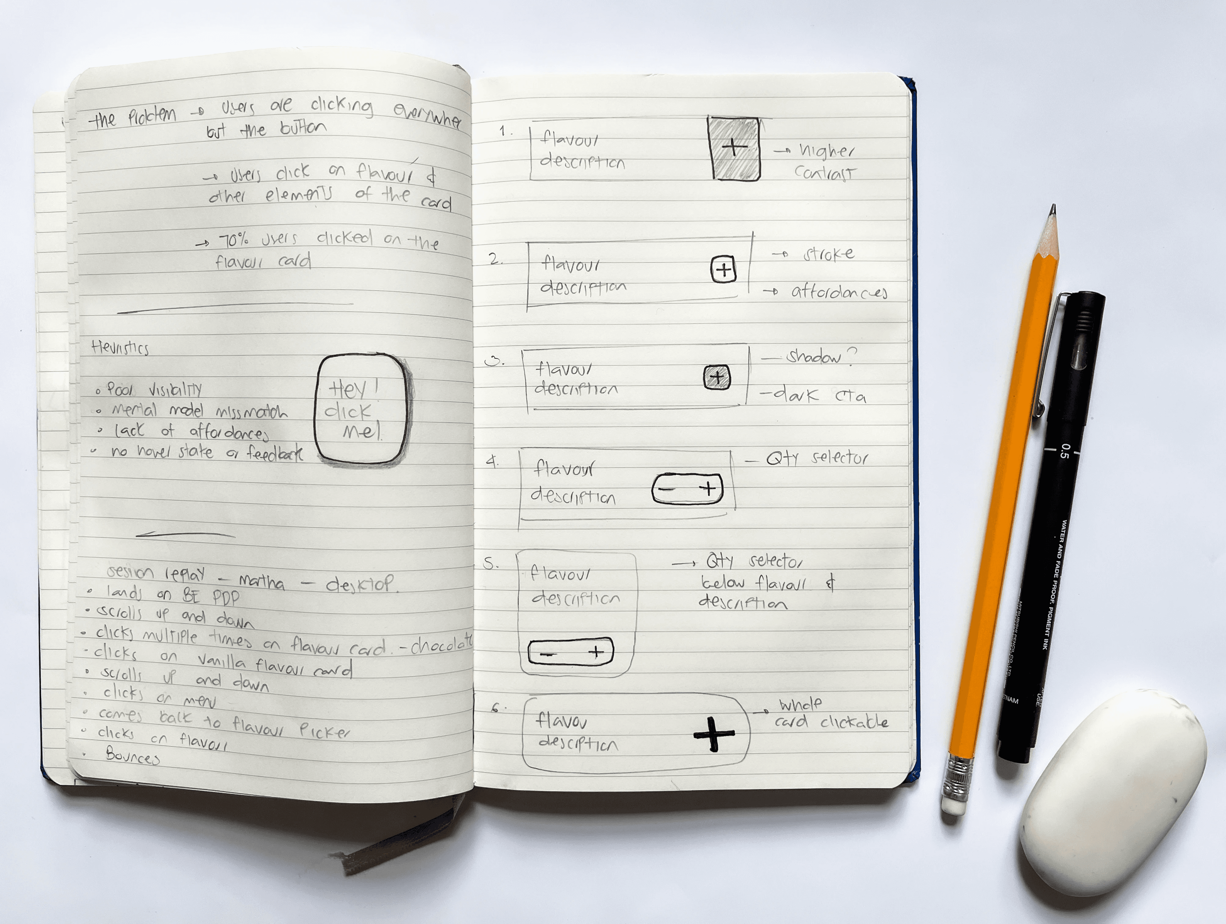
Users were clicking everywhere but the “+” button. They clicked / tapped the flavour card, the text, and anything else that looked clickable.
Clearly, the button lacked visibility and didn’t scream, “Hey, click me!”
Our minimalist design, while visually clean, created unintended friction for users.
Users were clicking everywhere but the “+” button. They clicked / tapped the flavour card, the text, and anything else that looked clickable.
Clearly, the button lacked visibility and didn’t scream, “Hey, click me!”
Discovery
Discovery
Digging Deeper To Understand User Behaviour
Digging Deeper To Understand User Behaviour
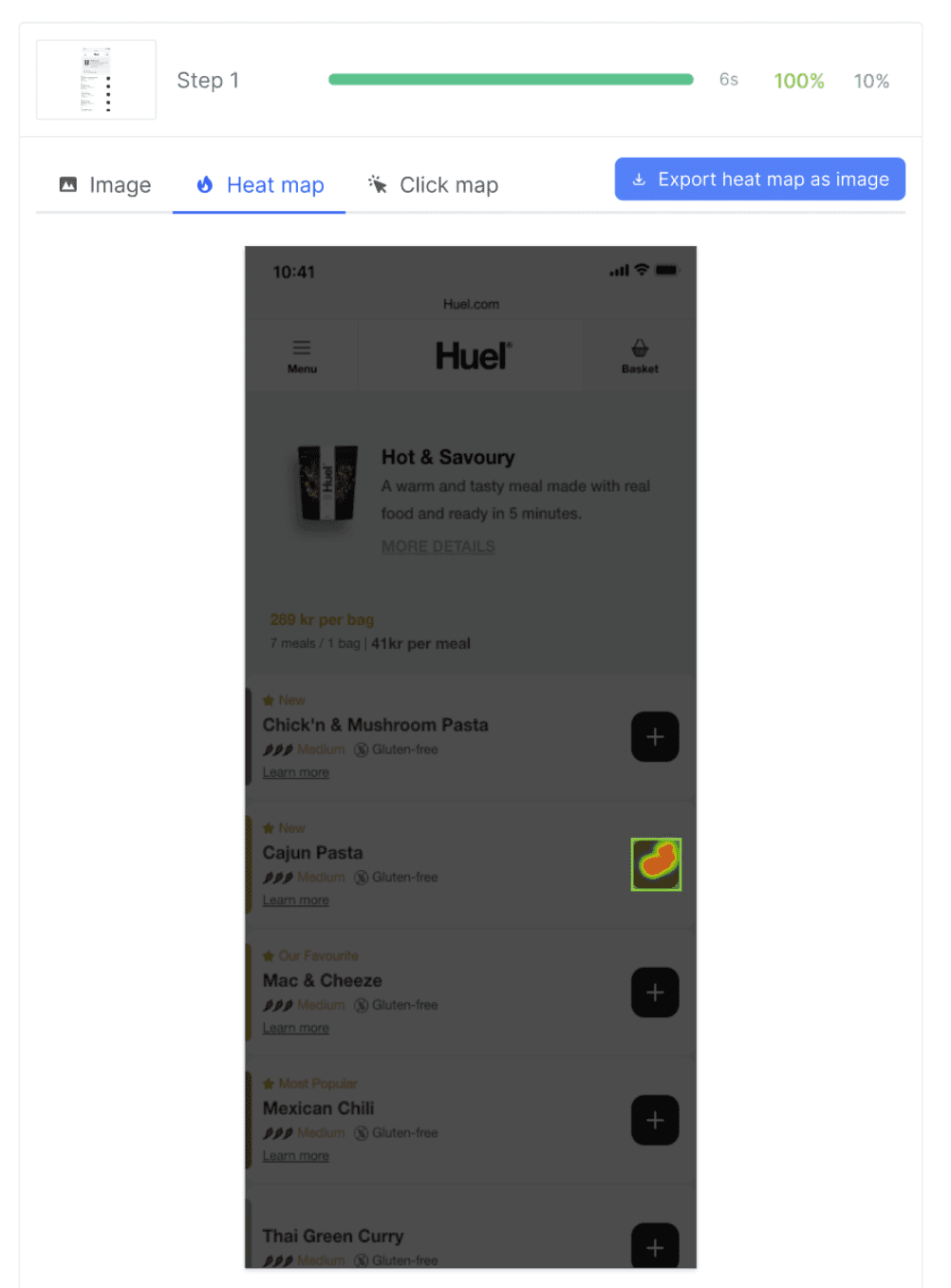
Before diving into solutions, we prioritised understanding the “why.”
Through an in-depth review of dozens of session recordings, we analysed mouse movements, hesitation points, and “rage clicks.” The findings…
Before diving into solutions, we prioritised understanding the “why.”
Through an in-depth review of dozens of session recordings, we analysed mouse movements, hesitation points, and “rage clicks.” The findings…
User Behaviour Analysis:
User Behaviour Analysis:
•
•
65% misclicks. Users clicked on the flavor card or text instead of the "+" button
65% misclicks. Users clicked on the flavor card or text instead of the "+" button
•
•
Frustration. "I thought I was adding it to my cart when I clicked the flavour name. Nothing happened, so I tried again... and again. Eventually I just gave up."
Frustration. "I thought I was adding it to my cart when I clicked the flavour name. Nothing happened, so I tried again... and again. Eventually I just gave up."
•
•
Rage click behaviour. Multiple rage clicks were observed before users abandoned their purchase attempts
Rage click behaviour. Multiple rage clicks were observed before users abandoned their purchase attempts
Heuristic Evaluation Highlights:
Heuristic Evaluation Highlights:
1.
No hover states or visual confirmation left users uncertain if their actions registered
Visibility of System Status.
1.
No hover states or visual confirmation left users uncertain if their actions registered
Visibility of System Status.
1.
No hover states or visual confirmation left users uncertain if their actions registered
Visibility of System Status.
1.
No hover states or visual confirmation left users uncertain if their actions registered
Visibility of System Status.
2.
Users expected the entire card to be clickable, as is standard across e-commerce
Mismatch with Mental Models.
2.
Users expected the entire card to be clickable, as is standard across e-commerce
Mismatch with Mental Models.
2.
Users expected the entire card to be clickable, as is standard across e-commerce
Mismatch with Mental Models.
2.
Users expected the entire card to be clickable, as is standard across e-commerce
Mismatch with Mental Models.
3.
Users had to search for the button instead of intuitively recognizing it
Recognition vs. Recall.
3.
Users had to search for the button instead of intuitively recognizing it
Recognition vs. Recall.
3.
Users had to search for the button instead of intuitively recognizing it
Recognition vs. Recall.
3.
Users had to search for the button instead of intuitively recognizing it
Recognition vs. Recall.
4.
The button had poor visibility and lacked visual cues signaling its interactivity
Affordance & Discoverability.
4.
The button had poor visibility and lacked visual cues signaling its interactivity
Affordance & Discoverability.
4.
The button had poor visibility and lacked visual cues signaling its interactivity
Affordance & Discoverability.
4.
The button had poor visibility and lacked visual cues signaling its interactivity
Affordance & Discoverability.
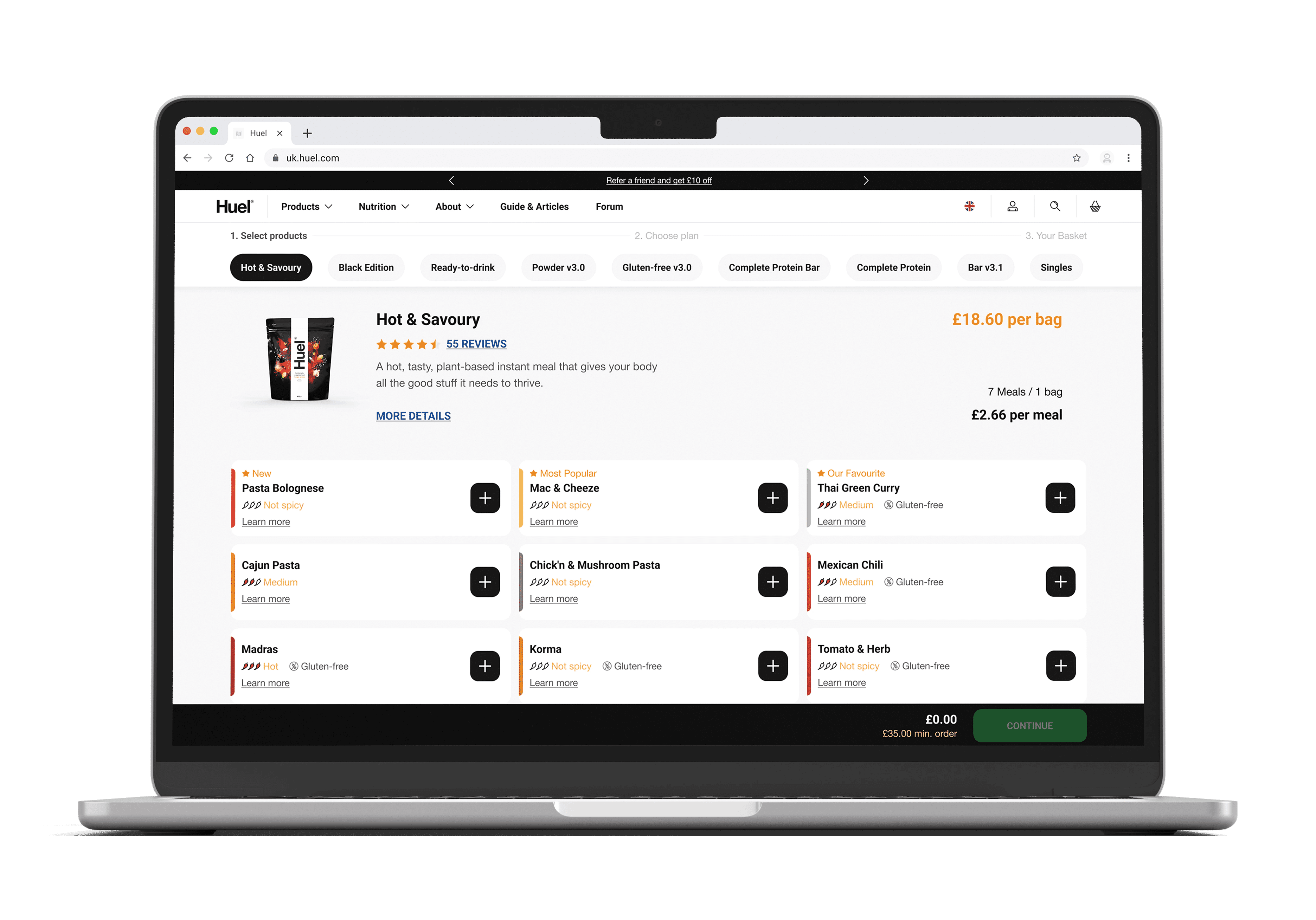
Competitive Analysis
Competitive Analysis
We examined five similar e-commerce sites and found they all used significantly larger CTAs with clear affordance cues, reinforcing our hypothesis that our design was creating unnecessary friction.
We examined five similar e-commerce sites and found they all used significantly larger CTAs with clear affordance cues, reinforcing our hypothesis that our design was creating unnecessary friction.
Diagnosis
Diagnosis
Root Causes Identified
Root Causes Identified
Through root cause analysis, we pinpointed the key barriers:
Through root cause analysis, we pinpointed the key barriers:
🔎
🔎
Low Contrast Ratio. The button lacked sufficient visual contrast, making it easy to miss.
Low Contrast Ratio. The button lacked sufficient visual contrast, making it easy to miss.
🚫
🚫
No Affordance Cues. Users struggled to identify the button’s function due to its understated design, it lacked visual cues that would signal "I am clickable" to users.
No Affordance Cues. Users struggled to identify the button’s function due to its understated design, it lacked visual cues that would signal "I am clickable" to users.
📚
📚
F-Pattern Reading. Users scanned the flavour name and product details, expecting interaction points aligned with those areas.
F-Pattern Reading. Users scanned the flavour name and product details, expecting interaction points aligned with those areas.
Ideation
Ideation
Rethinking CTA Interaction and Visual Hierarchy
Rethinking CTA Interaction and Visual Hierarchy
We approached the challenge with a clear goal to guide users more effectively while maintaining a clean and intuitive product card design.
We approached the challenge with a clear goal to guide users more effectively while maintaining a clean and intuitive product card design.
Goal Objective:
Goal Objective:
To enhance the visibility and interaction of the “+” button on product flavour cards, ensuring users can easily identify and engage with the primary call-to-action (CTA).
To enhance the visibility and interaction of the “+” button on product flavour cards, ensuring users can easily identify and engage with the primary call-to-action (CTA).
Key Goals:
Key Goals:
Increase Add-to-Cart Rate: Improve the conversion rate by making the button more noticeable and accessible.
Increase Add-to-Cart Rate: Improve the conversion rate by making the button more noticeable and accessible.
Reduce Mis-Clicks: Minimize user errors and frustration by aligning interaction points with user expectations.
Reduce Mis-Clicks: Minimize user errors and frustration by aligning interaction points with user expectations.
Enhance User Satisfaction: Create a seamless and intuitive shopping experience that boosts confidence and satisfaction.
Enhance User Satisfaction: Create a seamless and intuitive shopping experience that boosts confidence and satisfaction.
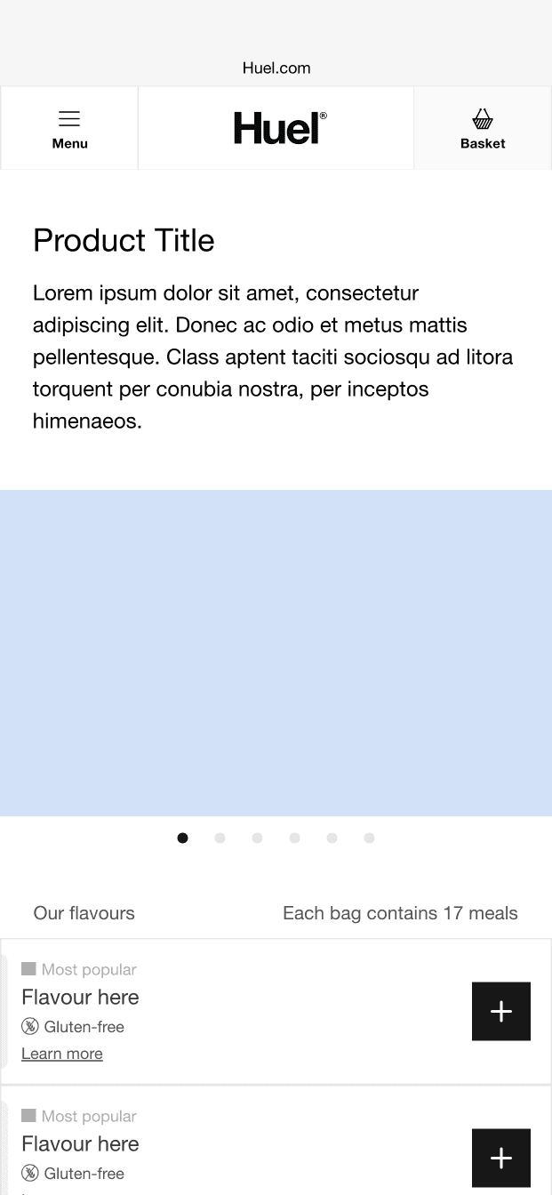
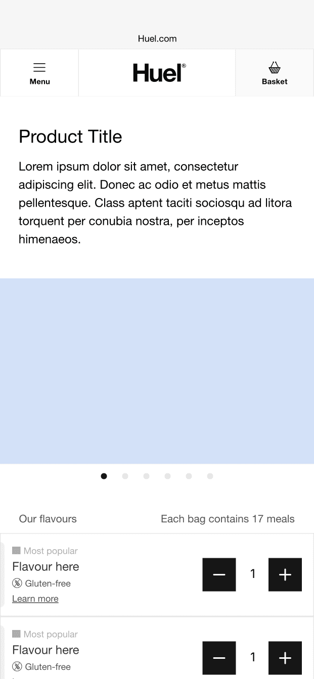
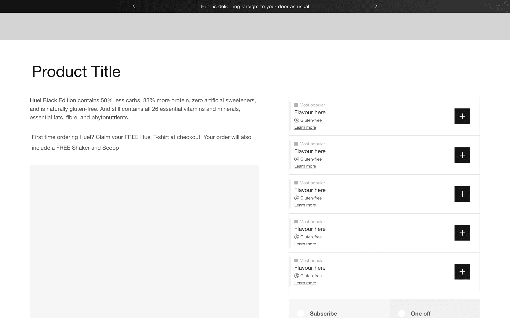
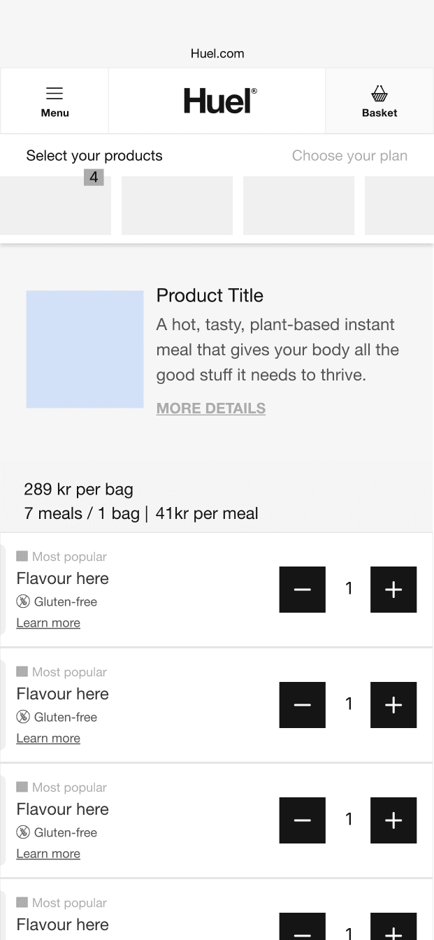
Proposed Solutions
Proposed Solutions
💡
💡
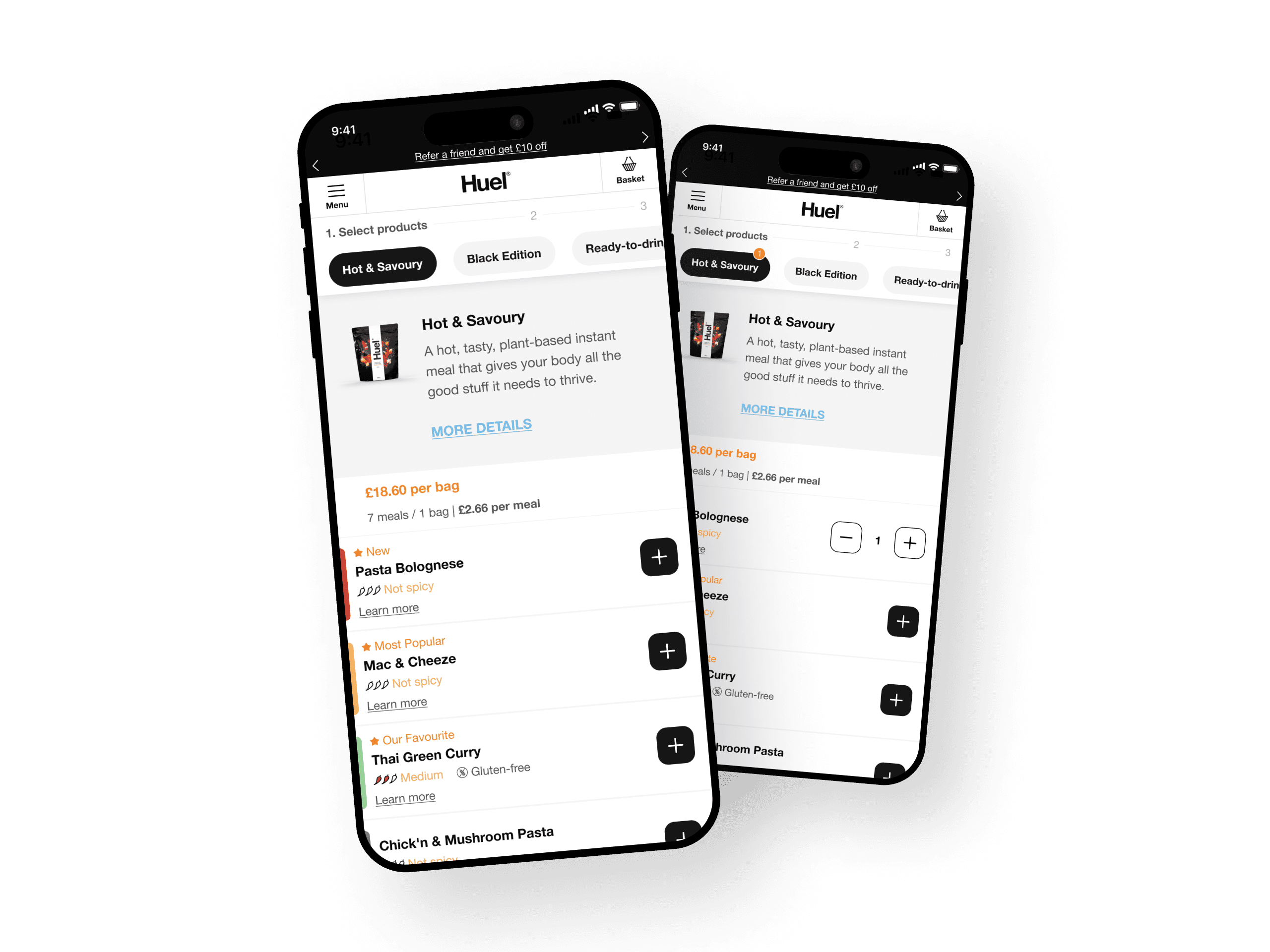
Increase Button Contrast and Size. A larger, high-contrast button would capture attention and signal its function.
Increase Button Contrast and Size. A larger, high-contrast button would capture attention and signal its function.
💡
💡
Expand Clickable Area. Aligning with user expectations, we considered making the entire card clickable to reduce cognitive load.
Expand Clickable Area. Aligning with user expectations, we considered making the entire card clickable to reduce cognitive load.
💡
💡
Enhanced Visual Feedback. Micro-interactions, hover states, and tap feedback would provide users with a sense of control and confirmation.
Enhanced Visual Feedback. Micro-interactions, hover states, and tap feedback would provide users with a sense of control and confirmation.
Design Constraints
Design Constraints
Adjusting for Feasibility
Adjusting for Feasibility
After initial exploration, we discovered a significant limitation. Our front-end architecture didn’t support making the entire product card clickable.
With this constraint in mind, we refined our approach to focus on:
After initial exploration, we discovered a significant limitation. Our front-end architecture didn’t support making the entire product card clickable.
With this constraint in mind, we refined our approach to focus on:
High-Contrast Colours. Ensuring a contrast ratio of 4.5:1 to meet WCAG AA standards.
High-Contrast Colours. Ensuring a contrast ratio of 4.5:1 to meet WCAG AA standards.
Clear Affordances. Establish a clear visual language that communicates "Hey, I am clickable" to users.
Clear Affordances. Establish a clear visual language that communicates "Hey, I am clickable" to users.
Micro-Interactions. Adding a hover state with a 200ms colour transition, and a subtle “pulse” animation when the button is clicked or tapped.
Micro-Interactions. Adding a hover state with a 200ms colour transition, and a subtle “pulse” animation when the button is clicked or tapped.
Solution Process
Solution Process
Designing for Discovery
Designing for Discovery
In collaboration with my design lead, product, and development teams, I iterated through multiple design concepts, striking a balance between usability improvements and maintaining our brand’s clean, bold aesthetic.
In collaboration with my design lead, product, and development teams, I iterated through multiple design concepts, striking a balance between usability improvements and maintaining our brand’s clean, bold aesthetic.
Design Hypotheses We Tested:
Design Hypotheses We Tested:
•
•
Increasing button size and contrast would improve visibility.
Increasing button size and contrast would improve visibility.
•
•
Adding hover and tap feedback would provide users with clear interaction cues.
Adding hover and tap feedback would provide users with clear interaction cues.
Button States
Button States
Default
Default
Hover
Hover
Active
Active
Focused
Focused
Disabled
Disabled
Flavour Picker States
Flavour Picker States
Collapsed
Collapsed

Expands
Expands
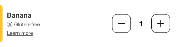
Expands Hover
Expands Hover
Testing Process
Testing Process
Validating Our Solutions
Validating Our Solutions
We conducted unmoderated usability tests with 10 participants, assigning them a critical shopping task: “Imagine you want to buy two bags of Cajun pasta. How would you add them to your cart?”
We conducted unmoderated usability tests with 10 participants, assigning them a critical shopping task: “Imagine you want to buy two bags of Cajun pasta. How would you add them to your cart?”
Findings
Findings
🎯
🎯
2.
100% Success Rate. Participants completed the task successfully.
100% Success Rate. Participants completed the task successfully.
Item here
⏩
⏩
2.
Faster Interaction Times. Reduced hesitation and improved interaction speed.
Faster Interaction Times. Reduced hesitation and improved interaction speed.
Item here
✅
✅
2.
Reduced Mis-Clicks.
Reduced Mis-Clicks.
Item here
A/B TESTING
A/B TESTING
Numbers Tell the Story
Numbers Tell the Story
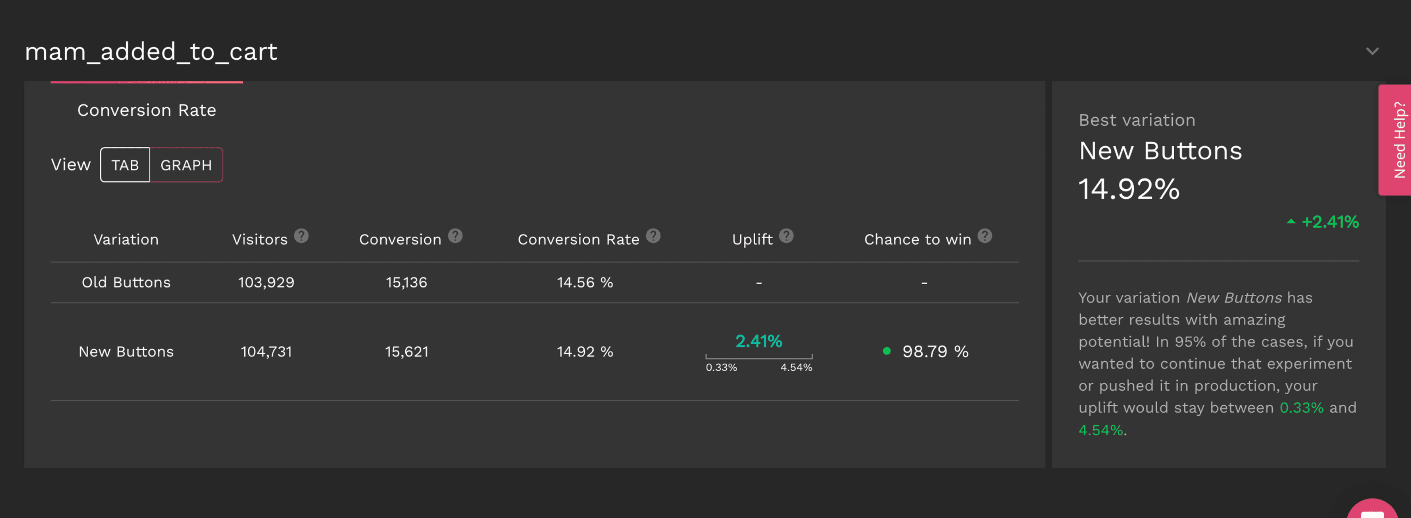
To quantify the effectiveness of our redesign, we conducted an A/B test comparing the original and improved designs.
To quantify the effectiveness of our redesign, we conducted an A/B test comparing the original and improved designs.
Control Group. Original design.
Variant Group. Users were presented with the improved bold "+" call-to-action.
Sample Size: 50% of mobile traffic per group.
Duration: 5 weeks (ensuring statistical reliability).
Control Group. Original design.
Variant Group. Users were presented with the improved bold "+" call-to-action.
Sample Size: 50% of mobile traffic per group.
Duration: 5 weeks (ensuring statistical reliability).
Key Metrics Monitored:
Key Metrics Monitored:
Click-Through Rate (CTR): How often users engaged with the “+” button.
Click-Through Rate (CTR): How often users engaged with the “+” button.
Task Completion Time: Average time taken to add items to the cart.
Task Completion Time: Average time taken to add items to the cart.
Error Rate: Reduction in mis-clicks on non-clickable areas.
Error Rate: Reduction in mis-clicks on non-clickable areas.
The Results…
The Results…
📈
Conversion rate increased from 14.56% to 14.92%
⏱️
Faster Task Completion: 18% reduction in average task completion time.
✅
Reduced Mis-Clicks: 30% drop in clicks on non-clickable areas.
📈
Conversion rate increased from 14.56% to 14.92%
⏱️
Faster Task Completion: 18% reduction in average task completion time.
✅
Reduced Mis-Clicks: 30% drop in clicks on non-clickable areas.
📈
Conversion rate increased from 14.56% to 14.92%
⏱️
Faster Task Completion: 18% reduction in average task completion time.
✅
Reduced Mis-Clicks: 30% drop in clicks on non-clickable areas.
The Outcome
The Outcome
A More Intuitive Shopping Experience
A More Intuitive Shopping Experience
By enhancing CTA visibility, aligning interaction patterns with user expectations, and introducing clear affordance cues, we transformed a frustrating experience into a seamless, intuitive journey.
By enhancing CTA visibility, aligning interaction patterns with user expectations, and introducing clear affordance cues, we transformed a frustrating experience into a seamless, intuitive journey.
+52 %
Conversion Rate
increasing from 2.5% to 3.8%.
+52 %
Conversion Rate
increasing from 2.5% to 3.8%.
+52 %
Conversion Rate
increasing from 2.5% to 3.8%.
+52 %
Conversion Rate
increasing from 2.5% to 3.8%.
+15 %
Customer Satisfaction
as reflected in post-test surveys.
+15 %
Customer Satisfaction
as reflected in post-test surveys.
+15 %
Customer Satisfaction
as reflected in post-test surveys.
+15 %
Customer Satisfaction
as reflected in post-test surveys.
-30 %
Mis-clicks
improving user accuracy.
-30 %
Mis-clicks
improving user accuracy.
-30 %
Mis-clicks
improving user accuracy.
-30 %
Mis-clicks
improving user accuracy.
+15 %
Cart Abandonment
leading to higher checkout completion.
+15 %
Cart Abandonment
leading to higher checkout completion.
+15 %
Cart Abandonment
leading to higher checkout completion.
+15 %
Cart Abandonment
leading to higher checkout completion.