Optimising Product
Discovery on Mobile
Product discovery is a crucial element of e-commerce success, yet mobile users often struggle with intuitive navigation. This case study explores how a seemingly minor UX issue led to significant engagement challenges.
Company: HUEL
Date: September 2022
The Challenge
A Hidden World of Products
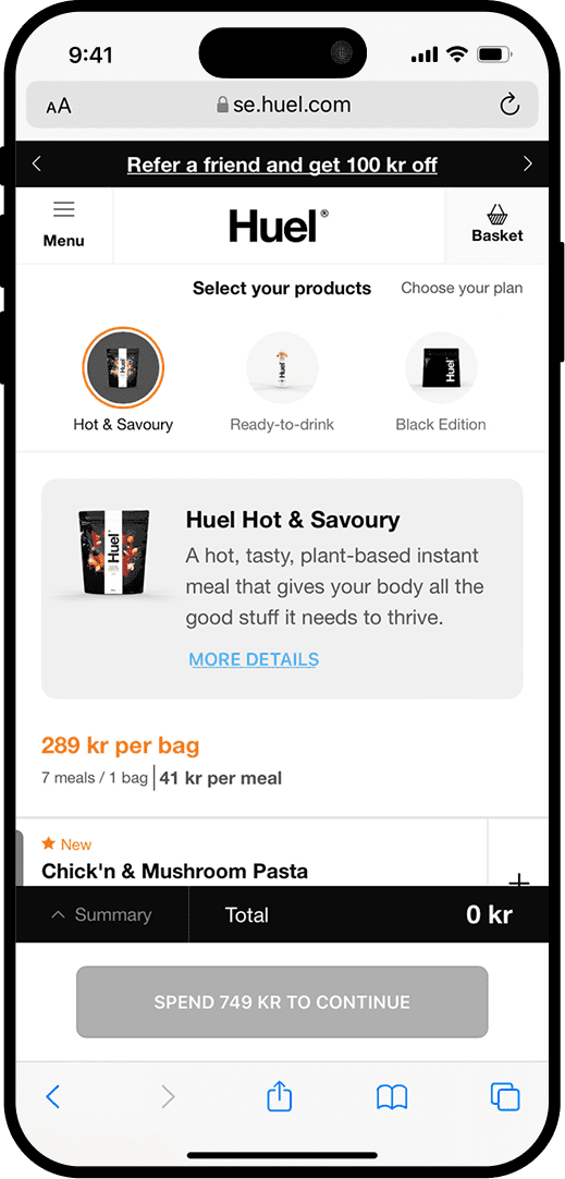
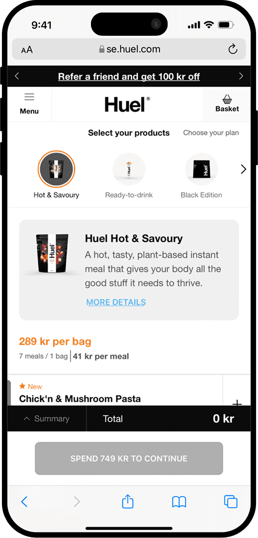
It started with a quiet observation, something wasn’t right with our product navigation bar on mobile.
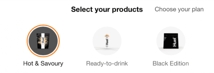
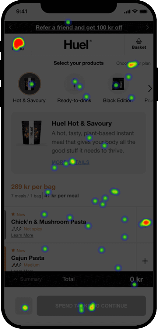
We had just launched a new product navigation bar that allowed users to swipe horizontally through product categories. But analytics and user session replays revealed a problem: users weren’t swiping far enough. Instead, they kept interacting with the same three products, unaware that more options were just a swipe away.
impact
was significant…
•
Low Product Discovery. Users viewed an average of only 3 products per session.
•
High Exit Rate. 16.5% of users left from the landing page without engaging further
•
42.7% Bounce Rate. For users who interacted with the landing page.
•
Navigation Confusion. Session replays showed users getting stuck, moving back and forth within the visible range of products, without realizing they could scroll further.
The problem was clear…
How do we help users explore more products without overwhelming them or adding unnecessary friction?
RESEARCH
Understanding User Pain Points.
We knew we had to understand the root of the issue, so we took a structured research approach, combining qualitative and quantitative methods to identify the root of the issue.
1.
Session Replays: A Missing Cue
When reviewing session recordings, we discovered that most users did not realize the product list was scrollable.
Many assumed that the first few products shown were the only available options.
2.
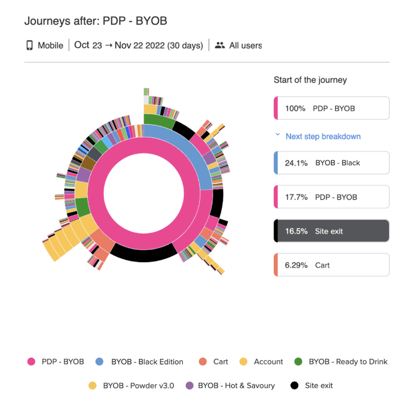
Heatmaps & Click Analytics:
Drop-off Insights.
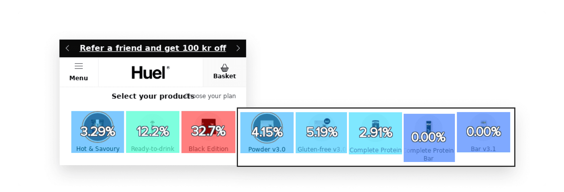
Heatmaps confirmed that most user interactions were concentrated on the first three visible products.
The click rates dropped sharply beyond these initial items, suggesting that users weren’t engaging with hidden products.
3.
Usability Testing: Confirming the Issue
We conducted a moderated usability study with 5 participants.
Task: Imagine you’re looking for a product called 'Powder v3.' How would you go about finding it on this site?
60% did not attempt to scroll at all.
40% repeatedly interacted with the same visible products, unable to find the item referenced in the task.
Frustration was high, as users struggled to find a specific product without realising that scrolling was an option.
4.
Qualitative Interviews: Understanding the Why
When conducting the follow-up interviews with the users, these were the main insights:
Lack of Visual Feedback: Users expected an indicator or cue to let them know more products were available.
Unclear Affordances: No signifiers suggested that horizontal scrolling was possible.
"Oh, there are more products hidden!
"I didn't know I could swipe, I thought that was all what was available"
OUR GOAL
To enhance product navigation by creating a seamless, engaging, and user-friendly experience that naturally guides users without adding friction.
Our focus was to increase the average number of products viewed per session, reduce bounce rates on product pages, and drive more horizontal scroll interactions to improve overall product discovery.
Enhancing The Product Navigation.
We set out to create a seamless and intuitive navigation experience, ensuring users could effortlessly explore the full product range. After brainstorming and sketching ideas, we developed a solution that not only addressed immediate issues but also improved the overall user experience.
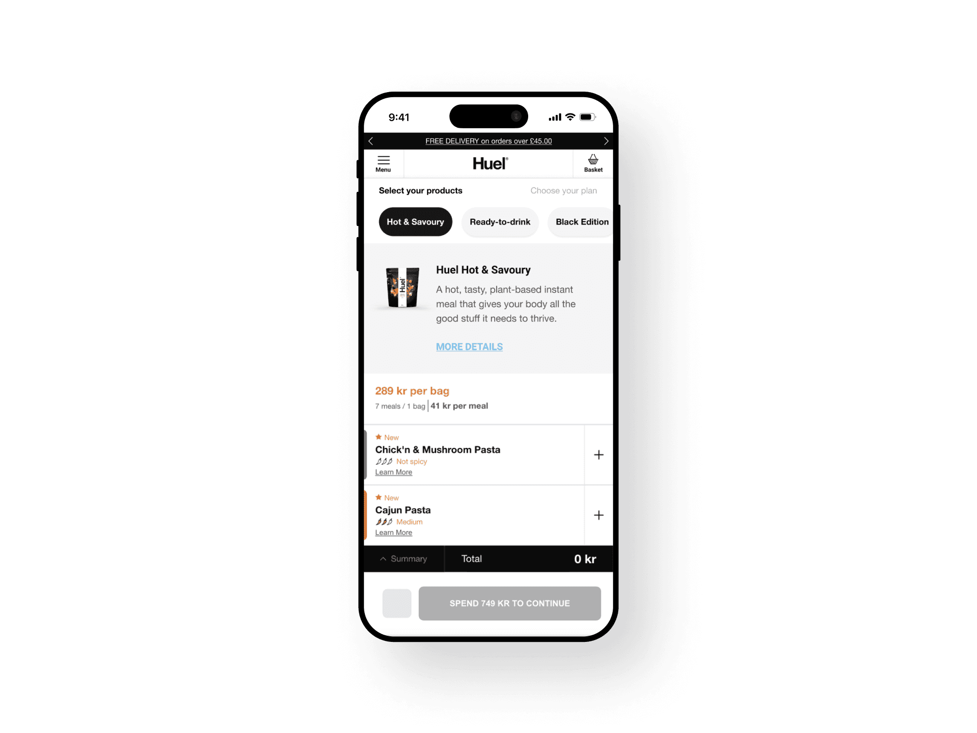
Initial Solution.
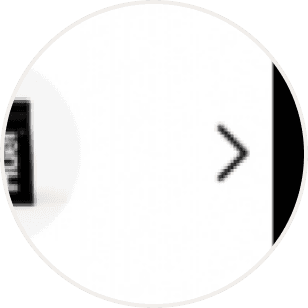
Our initial solution was a subtle right-facing arrow at the edge of the product carousel, suggesting that more products could be discovered by swiping. We then moved on to additional testing.
User Testing.
We conducted an unmoderated usability study with 8 participants and asked them to complete the same task.
Task:
Imagine you’re looking for a product called 'Powder v3.' How would you go about finding it on this site?
The Findings…
•
25% did not complete the task.
•
37.5% remained within the visible products, failing to scroll.
•
Rage Click Observed: Users clicked on the menu and other elements instead of scrolling.
•
User Feedback: "Arrow was not obvious enough"
Conclusion.
The arrow alone failed to guide users effectively. We needed a more intuitive approach.
Iterating
Rethinking the Navigation Experience.
Building on our initial research, we re-evaluated the navigation system by analyzing user behavior and synthesizing insights through an affinity diagram.
This process informed a series of data-driven design improvements that directly addressed key user pain points.
Our key solutions..
Increased Contrast. We enhanced the contrast to improve visibility, ensuring users could easily differentiate navigation elements and recognize the scrollable content.
Enhanced Visual Hierarchy. We reduced clutter by simplifying the product navigation bar, giving more prominence to essential elements and reducing unnecessary imagery.
Scroll Feedback. To make scrolling feel interactive, we introduced a subtle motion effect. When users tapped a category, the navigation bar repositioned to its starting point, revealing more products.
Onboarding Animation. A subtle onboarding animation played when users first landed on the page, demonstrating the scrolling behavior. This gentle cue sets the right expectation without feeling intrusive.
TESTING
Evaluating the Second Iteration
We moved from concept to prototype, using wireframes to map out the new design elements. The changes were simple, but we knew they could make a big difference
We tested two prototype variants with 8 participants each to determine the most effective approach
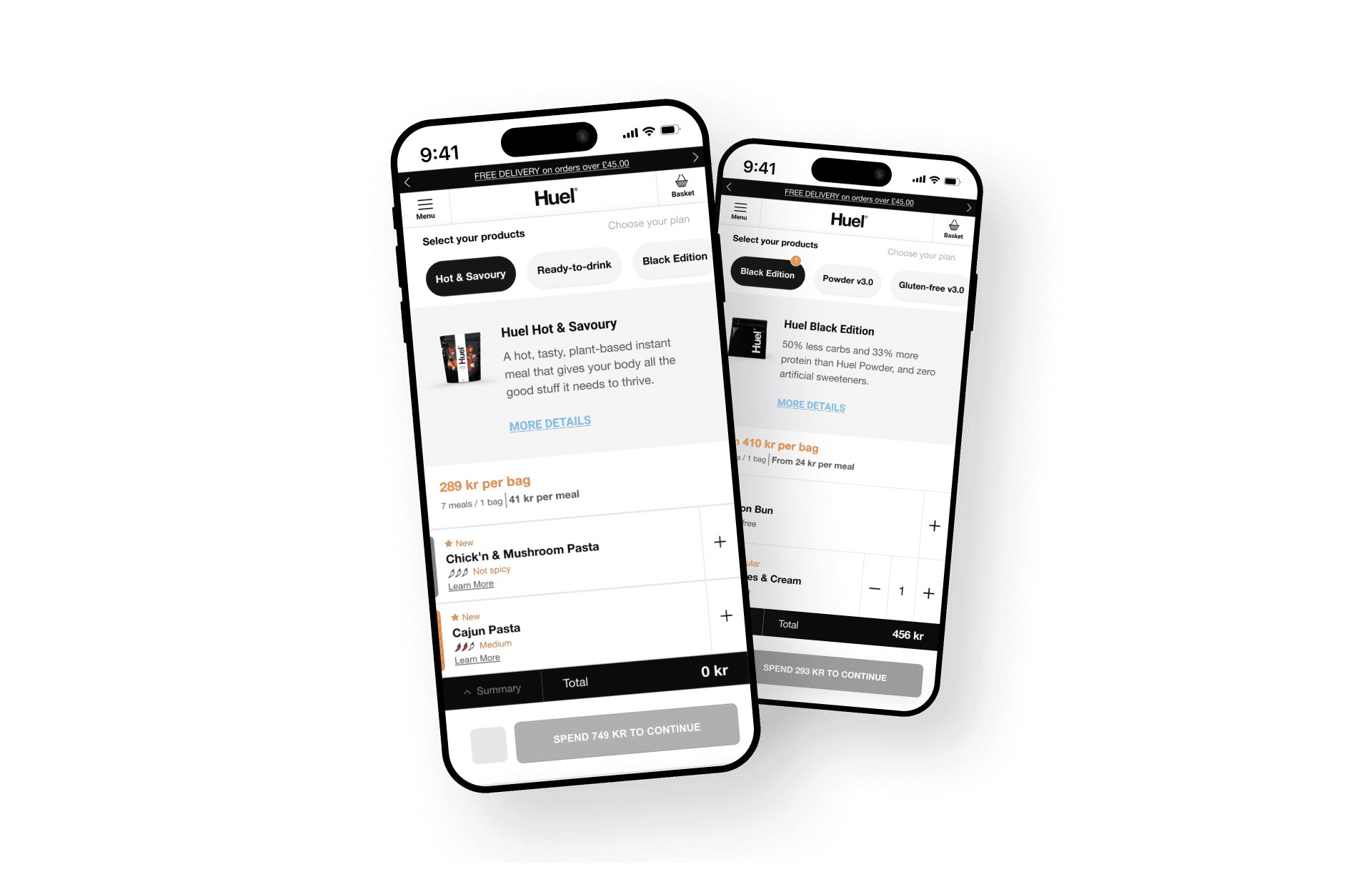
Variant 1
On this variant, we tested the horizontal scrolling without the navigation arrows.
Test Setup:
Unmoderated testing
8 Participants
Task remained the same:
"Imagine you’re looking for a product called 'Powder v3.' How would you go about finding it on this site?"
The Results…
•
50% successfully swiped with no issues.
•
37.5% discovered products by tapping one at a time.
•
12.5% failed to complete the task.
•
User Feedback:
38% found the experience very easy, 50% easy, 13% difficult.
Variant 2
On this variant, we tested the horizontal scrolling with the navigation arrows.
Test Setup:
Unmoderated testing
8 Participants
Task remained the same:
"Imagine you’re looking for a product called 'Powder v3.' How would you go about finding it on this site?"
The Results…
•
37.5% swiped seamlessly.
•
50% navigated by tapping products individually.
•
12.5% failed to complete the task.
•
25% of users experienced rage-clicking behavior.
•
User Feedback:
63% found the experience very easy, 13% neutral, 25% difficult.
The Outcome
We found that the version without navigation arrows was more effective, as it encouraged natural scrolling behaviour. Based on this insight, we conducted further testing to validate its impact.
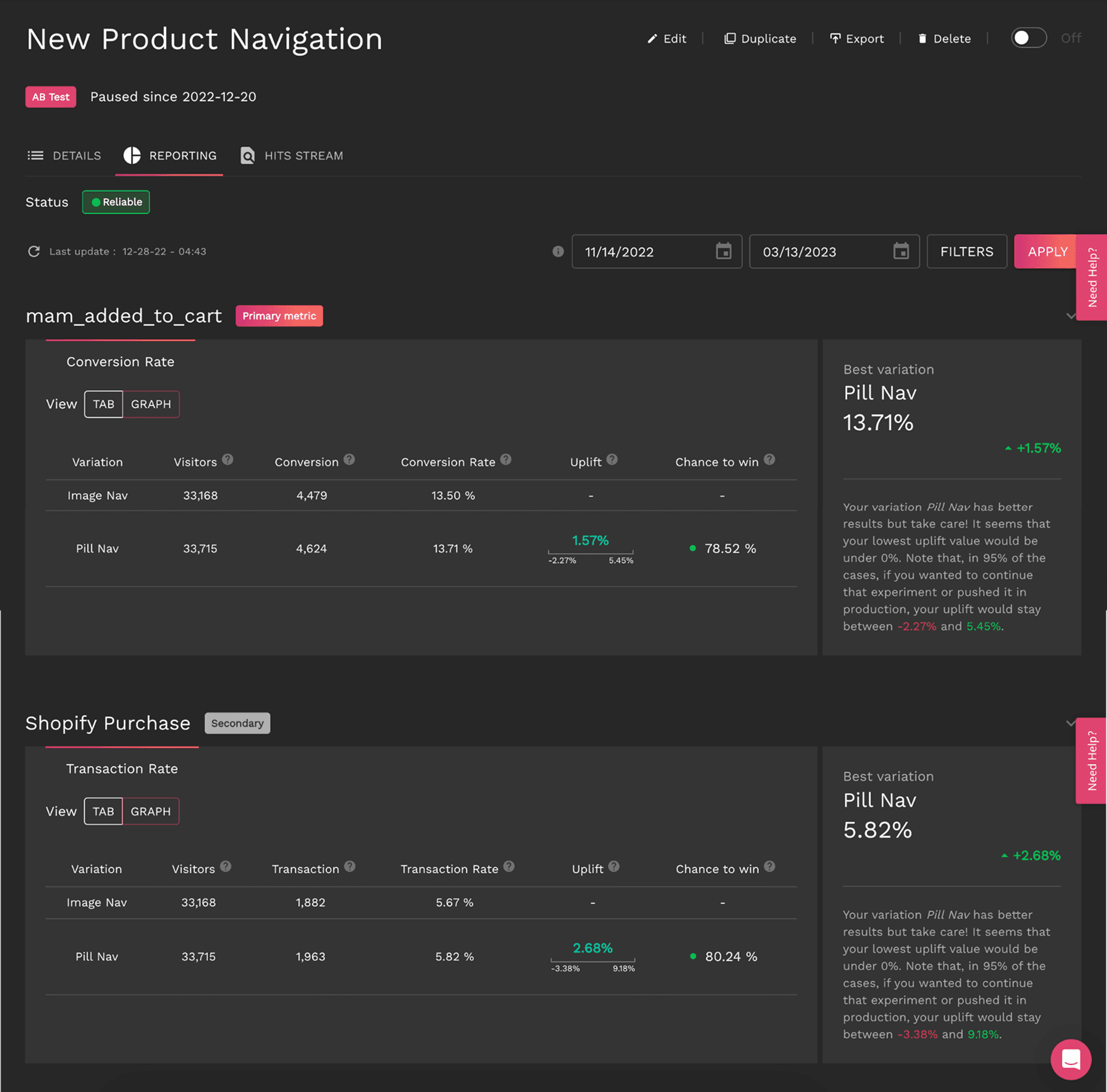
A/B TESTING
Measuring Real-World Impact
To validate our design changes at scale, we ran an A/B test of both - the new and the old - navigation bars with a statistically significant sample size:
Control Group: Original design. Navigation Bar with images and cues.
Variant Group: Users were presented with the improved navigation bar.
Sample Size: 50% of mobile traffic per group.
Duration: 6 weeks (ensuring statistical reliability).
Key Metrics Monitored:
Views & Engagement: Were users interacting with more products?
Bounce & Exit Rates: Were users staying longer instead of leaving prematurely?
Scroll Rate & Time Spent: Were users engaging more with the navigation bar?
Conversion Rate: Did the improved navigation lead to higher purchases?
Four Weeks In, a Tough Call to Make
After four weeks, the test results remained inconclusive, with progress slower than expected.
Based on current performance, achieving statistical significance would have required running the test for an additional 328 days.
Given this timeline, we decided to pause the test to prioritize other tests and shift focus toward deeper behavioral analysis using ContentSquare.
Diving into users behaviour
We then analyzed both segments during the A/B test period, leveraging ContentSquare to compare key engagement metrics, including product views, bounce rate, exit rate, time spent, and conversion rates.
The analytics dashboard revealed a notable improvement in user engagement, confirming that the enhanced navigation positively influenced user behavior.
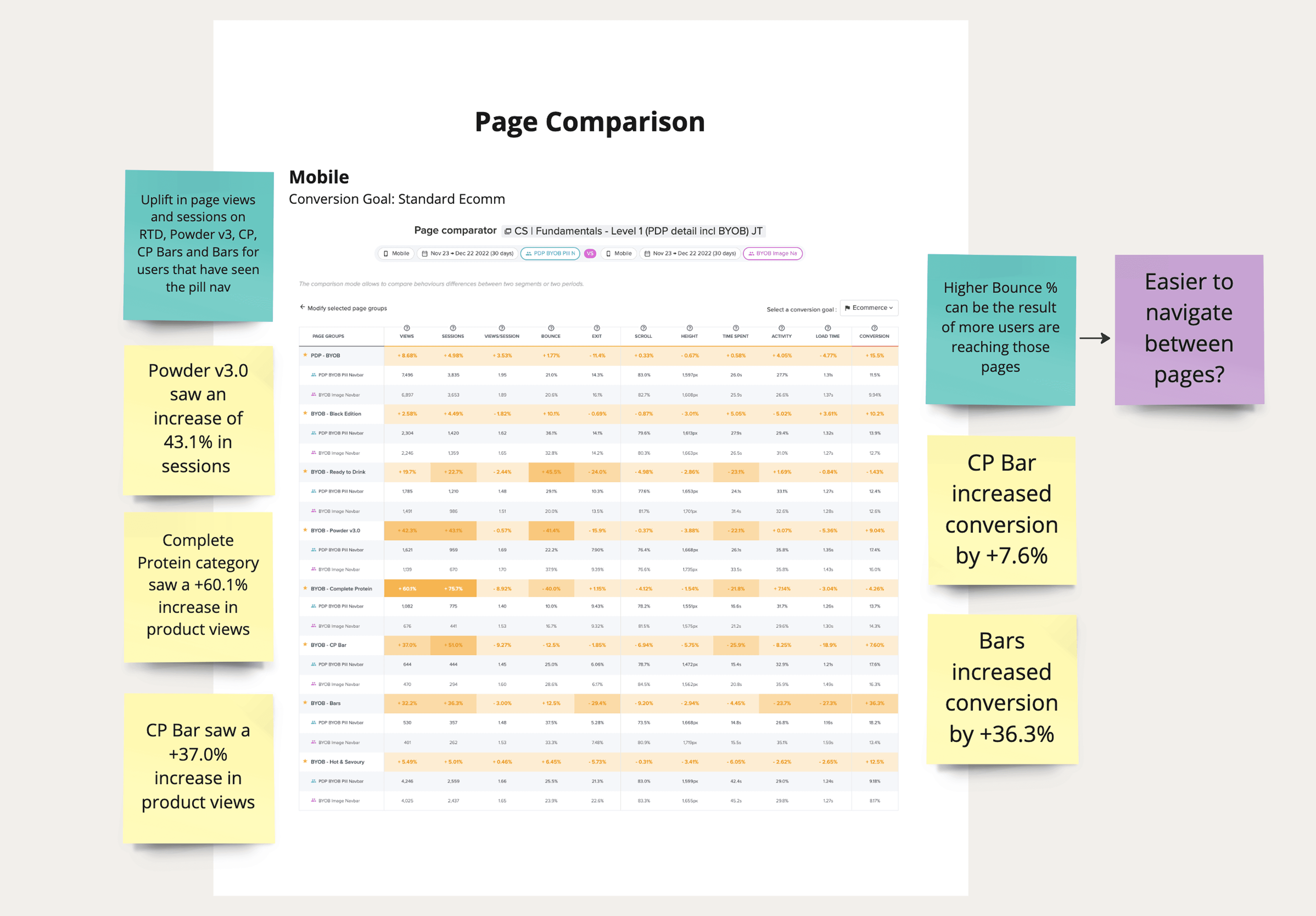
Key Results
Measuring Real-World Impact
Product Views Per Session
+8.68 %
with some products increasing by 60.1%.
Time Spent on Navigation Bar
+4.05 %
Bounce Rate Reduction
-8.92 %
on key product pages.
Conversion Rate Increase
+15.5 %
with some product categories up by 36.3%.